-
统计文档内所有标签
-
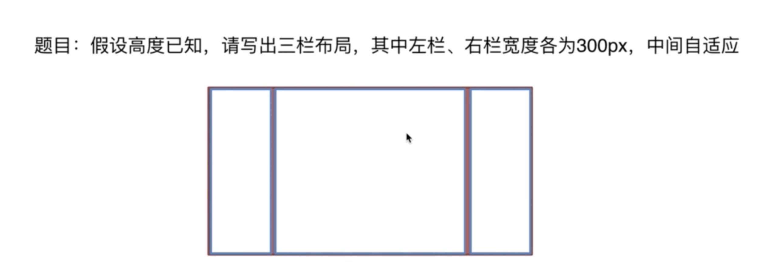
三栏布局,高度已知,左右两栏各
300px,中间自适应
统计文档内所有标签
统计下列标签,返回结果放在一个数组内,均为小写,可以不按照顺序,示例如下。
html
<html>
  <head></head>
  <body>
    <div></div>
    <p></p>
  </body>
</html>
js
// 返回
["html", "head", "body", "div", "p"]
第一种:根据js内置函数递归获取(document.all)
js
function getTags() {
  var tags = document.all()
  var res = []
  for (const item of tags) {
    res.push(item.tagName.toLowerCase())
  }
  return res
}
第二种:getElmentByTagNames('*')
js
function getTags() {
  var tags = document.getElementsByTagName('*')
  var res = []
  for (const item of tags) {
    res.push(item.tagName.toLowerCase())
  }
  return res
}
三栏布局,高度已知,左右两栏各300px,中间自适应
介绍下方法和思路
-
float 布局
左栏和右栏浮动,中间默认
-
绝对定位
左栏
left:0右栏right:0中间left:300px; right:300px; -
flex布局
父元素设置为
display: flex;设置左右宽为300px
中间设置
flex: 1;相当于flex-grow:1; -
table布局
父元素
display: table;子元素
display: table-cell;左右各为
300px -
grid布局
通过设置
row和column来控制
建议将如下代码粘贴到编辑器里查看
html
<!DOCTYPE html>
<html lang="en">
  <head>
    <meta charset="UTF-8" />
    <meta name="viewport" content="width=device-width, initial-scale=1.0" />
    <title>三栏布局</title>
    <style>
      html {
        padding: 0;
        margin: 0;
      }
      .layout {
        margin: 10px 0;
      }
      .left-center-right div {
        min-height: 100px;
      }
      .left-center-right .left {
        background-color: yellow;
      }
      .left-center-right .center {
        background-color: red;
      }
      .left-center-right .right {
        background-color: blue;
      }
    </style>
  </head>
  <body>
    <!-- 浮动布局 -->
    <section class="layout">
      <style>
        .float .left {
          width: 300px;
          float: left;
        }
        .float .center {
        }
        .float .right {
          width: 300px;
          float: right;
        }
      </style>
      <article class="left-center-right float">
        <div class="left"></div>
        <div class="right"></div>
        <div class="center">
          1. 浮动布局
        </div>
      </article>
    </section>

    <!-- 定位布局 -->
    <section class="layout">
      <style>
        .absoulte {
          position: relative;
        }
        .absoulte .left {
          position: absolute;
          width: 300px;
          left: 0;
        }.absoulte .center {
          position: absolute;
          left: 300px;
          right: 300px;
        }
        .absoulte .right {
          position: absolute;
          width: 300px;
          right: 0;
        }
      </style>
      <article class="left-center-right absoulte">
        <div class="left"></div>
        <div class="right"></div>
        <div class="center">
          2. 定位布局
        </div>
      </article>
    </section>

    <!-- 3. flex布局 -->
    <section class="layout">
      <style>
        .flex {
          margin-top: 120px;
          display: flex;
        }
        .flex .left {
          width: 300px;
        }
        .flex .center {
          flex: 1;
        }
        .flex .right {
          width: 300px;
        }
      </style>
      <article class="left-center-right flex">
        <div class="left"></div>
          <div class="center">
            3. flex布局
          </div>
        <div class="right"></div>
      </article>
    </section>

    <!-- table 布局 -->
    <section class="layout">
      <style>
        .table {
          width: 100%;
          height: 100px;
          display: table;
        }
        .table>div {
          display: table-cell;
        }
        .table .left {
          width: 300px;
        }
        .table .right {
          width: 300px;
        }
      </style>
      <article class="left-center-right table">
        <div class="left"></div>
        <div class="center">
          4. table 布局
        </div>
        <div class="right"></div>
      </article>
    </section>

    <!-- grid 布局 -->
    <section class="layout">
      <style>
        .grid {
          width: 100%;
          display: grid;
          grid-template-columns: 300px auto 300px;
          grid-template-rows: 100px;
        }
      </style>
      <article class="left-center-right grid">
        <div class="left"></div>
        <div class="center">
          5. grid 布局
        </div>
        <div class="right"></div>
      </article>
    </section>
  </body>
</html>